Saturday, 15 October 2016

A Beginner's Guide to Colour

Hello Everyone!

I write at the end of a truly manic week here at Nursery Knits UK.  Christmas orders are starting to come in and, with the Wish-Bear giveaway now closed (congratulations again to Lotus Girl), my needles and hook are constantly in use.  I can't wait for Christmas!

I've been overwhelmed by the lovely comments on my facebook page about my products, particularly about the colours I choose. Several of my facebook followers have said that they wouldn't have thought to put the colours together in the way I do, so I thought a blog post was long overdue.

Now, I'm not asserting myself as an expert in colour here.  There are some wonderful crafting artists out there with amazing eyes for colour that are far superior to my own, but I have picked up a few useful tips along the way and here they are.

1) KEEP IT SIMPLE

I find that a maximum of five colours works best.  Three gives it a real sense of balance.  If going for three, I prefer to choose two that are closely related (a deep purple and a lilac for example) and a contrast.  With five, it's nice to mix them up a little more.  I think I always have at least one "out there" colour in the mix though: it keeps things interesting.  I rarely use more than five colours, though, as it can look a little confusing and messy.

Silver, Storm, Sage and Denim (Stylecraft Special DK)


2) LOOK TO NATURE

We live in an incredibly beautiful world and (to misquote a famous paint manufacturer): "it knows the colours that go".    Quite often the most successful colourways are the ones that come from nature, rather than man-made things.

Take autumn for instance:
Image result for autumn image

In this one photo we have reds, purples, golds, greens, browns...a whole palette to choose from!  The star blanket above was inspired by a stormy sea crashing onto rocks.

3) PINTEREST!

Pinterest is amazing!  I got started in colour by looking at Pinterest.  I have a board featuring beautiful scenes from nature, another which has nature scenes with paint sample charts beside them, and another which has other crafter's suggestions of colourways.  Go crazy but remember the essential things like sleeping and eating and going to work etc. etc.  Pinterest is amazing but also a procrastinator's biggest enabler.
Sunset in Yellowstone National Park, Wyoming:
From my board: "Views I'd Like to See" - Sunset in Yellowstone Park.

...voor meer inspiratie www.stylingentrends.nl of www.facebook.com/stylingentrends #interieuradvies #verkoopstyling #woningfotografie:
From my board: "Paint Sample Colours"
Parchment, Mocha, Walnut, Denim, Cloud (Stylecraft Special DK Yarn Colour Pallette):
From my board: "Yarn Combo Suggestions".
4) EXPERIMENT!

Honestly though, a lot of colour choosing is trial and error and that is where a lot of the fun lies.  Play with colour, try things out, be bold, be brilliant!

5) GO WITH WHAT YOU LOVE.


I hope you find that helpful as a starting point :)  Have fun!

Saturday, 24 September 2016

Trend Spotter: British Wildlife - the best of handmade this Autumn

Original Artwork by Clare Brownlow
Hello everyone!

I was incredibly lucky as a child to have parents who agreed to paint my room pink, with pink carpet and to put up Forever Friends wallpaper border.  However, by the time I was ten I'd grown out of it and by the time I was in my teens I was desperate for an upgrade (which I luckily received).  Now owning my own home I truly appreciate the cost of paint and realise that a room that can be updated as easily as changing a duvet cover is perfect!  Take my nephew for example.  At the tender age of four he has already had three great loves in his life:  Frozen (which he just wouldn't let go!), Pirates and now Paw Patrol.  Imagine if his mum had gone down the borders and wall-stickers route?  These days, with a tendency to decorate using a neutral pallette, it couldn't be easier to update a room yearly, or even seasonally, according to what's on trend.

I love all things to do with British wildlife, and when my craft room one day becomes a nursery, it is certain to be filled with things inspired by our wonderful British countryside.  Beatrix Potter is an absolute must for me and my husband, who is equally keen on British wildlife, has already purchased two watercolours from a local artist which will soon be on my craft room walls.

Why is British wildlife such a perfect fit for a nursery?  There are three key reasons:

* it's timeless
* it's gender neutral
* it can help our children grow up with an awareness and appreciation of our unique countryside

Imagine my delight, then, to visit the Handmade Fair at Hampton Court Palace this September, to discover that British wildlife is becoming the hottest new trend.  What is more, with a clear theme of all things nostalgic, it is apparent that this is not going to be a passing fad.

So how can we embrace this in our nurseries?

1) Keep it warm and neutral

  White is a wonderful colour in an adult space, but in a nursery it can feel cold and shows the marks much more easily.  I've picked a warm vanilla colour for my walls.  It ties in beautifully with the shabby-chic trend that has been around for the last decade and doesn't seem likely to disappear.  It is also warm and cosy, perfect with soft lighting.  Finally, it is neutral and can easily be updated as a child's room to go with whatever they're "into" at the time.  Children are wonderful explorers and discoverers, with an incredible capacity to be amazed and enthralled by the tiniest things.  Keeping walls and window-treatments neutral will allow your little one to personalise their own space as they grow.

2) Buy British

Secondly, think carefully about buying British and hand-made.  If you can possibly afford it, it is a wonderful thing to support our local crafts-people and British businesses.  We are fortunate, as a nation, to have a long and illustrious history of artisan crafts so let's celebrate it!


3)  Be colour-savvy

Thirdly, be aware of colours and trends.  The adults clothes and household catalogues are a good indication of what's coming.  Remember the obsession with Scandi-style a few years ago?  This was swiftly followed by the rustic Highland appeal of stags and tartan, warm natural fabrics and colours.  This desire for warmth is set to continue with this season's key colours of mustard, russet, gold and plum.  Autumnal colours are in!

4) Keep it simple.

 Don't go all out and decorate a room entirely in one colour.  Don't invest hundreds in statement pieces that will look out of place by next season.  Go for little touches that can easily be updated.  Here are some of my favourites from the crafts-people at Hampton Court Palace...

Made by Lottie Day:  Her lampshade with the image of a hare is just stunning and perfect for an autumnal wildlife nursery!

Charley Lou Designs:  We just love her crayon-rolls!

Crayon Rolls by Charley Lou Designs

Corinne Lapierre:  Felt Designs which come as gorgeous kits for you to make yourself for baby.

Felt  Birdhouse by Corinne Lapierre


Fat Poppy Cat

Embrace a love of British wildlife with this stunning Kingfisher by Fat Poppy Cat

Hawthorn Handmade:  Designers and makers of needle-felt and crochet kits, Hawthorn Handmade use British wool (ethically sourced) for their needle-felting kits, and crochet yarn spun in a mill in Scotland.  Designer Stephanie is inspired by the Dorset countryside and who could resist this smart squirrel?  Visit their site now for more inspiration and to get crafting!

Needle-felt Squirrel Kit by Hawthorn Handmade

Hummy and Huggy:  A family business established and run by a mum to two young boys, Hummy and Huggy aim to create designs that little ones and their parents all adore!  Being a mum, she understands the importance of durability and practicality and their UK studio produce products with this in mind.  I fell in love with this tartan moose!  Who wouldn't want this moose loose aboot their hoose?

Moose by Hummy and Huggy


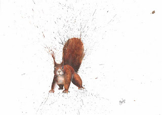
Clare Brownlow:  A young artist, Clare works in a unique way, using pheasant feathers and ink.  I am a huge fan of artwork on walls, especially as they can be swapped as you see fit.  However, if I had this little chappy on my wall he would be sure never to come down!


And what are we doing at Nursery Knits UK?  I've also embraced all things autumnal and am busy working on a boy's tank top in a gorgeous green colour using Debbie Bliss' Eco-Baby Yarn.  Watch this space for updates on the products!


Friday, 2 September 2016

TUTORIAL: Designing Relief Motifs

Hi there, Everyone!

I hope you've had a great week and are looking forward to some crafty time this weekend.  It can be really hard to carve out some time for yourself in amongst the chores and other demands on you, but nourishing activities such as crafting can be fabulous for your well-being.  I know I'm a much nicer person to be around if I can escape for even half an hour.  I love to try new ideas and techniques but find myself reaching for the old faithfuls when I'm pushed for time, as it takes a while to get hold of something new.  These tutorials are designed to make it easier for you to try something out and should help you make the most of your precious time.  I'd love to hear your thoughts: enjoy!


What are relief motifs?

Relief motifs are images worked into stocking stitch pieces.  The advantages are that they are subtle (no gaudy snowmen here!) and also worked in the same yarn as the main piece, allowing you to avoid the fiddly weaving of ends and working with two or three yarns simultaneously.

How did I come up with the idea?

Firstly, it turns out that this is not a wholly original idea.  There are fabulous examples of this sort of motif on Pinterest, so I can't claim credit for it.  However, the idea of using this style of motif to jazz up plain stocking stitch came about when I was creating the Tooth Fairy Pillows.

The first Tooth Fairy Pillow was worked in stocking stitch for the front, then plain garter stitch for the reverse.  It was functional and the self-patterning yarn I'd used for the front was effective, but it lacked a certain pzazz.  I knew I didn't want to over complicate it with cables or intarsia (tutorial coming soon) but I needed an effective way to create child-pleasing images and add interest to the plain little pillows.

Deep in thought, I absent-mindedly fiddled with the beautiful cabled throw my mother had made for me.  I must have sat there for about half an hour puzzling over it, when I realised that the answer was on my lap the whole time!


As you can see from this shot of the throw "in progress", the cables are worked using purl and knit stitches.  The knit stitches "pop" forwards, throwing the background into relief.  While cable itself was too fussy for my Tooth Fairy Pillows, I realised that I could use the "popping" effect to create images within stocking stitch.

I set to work and, after a lot of trial and error, the first pillow was complete:


So it really is that simple:  use the opposite stitch (purl to knit / knit to purl) to create a raised or indented design.  What does take time, however, is the planning out of your design, and this tutorial will take you through the steps to designing on Excel.  You can of course do this on graph paper, just ensure you do step 1 first!

STEP 1:  Check your tension

I know, I'm sorry: I hate tension squares too.  In fact, I usually don't bother with them (cue gasps of horror from seasoned knitters) but they are essential for when it comes to adapting and personalising a plain project.  This is because your design will be worked out in rows, so you need to know how many rows to however many inches you're planning on using.  A typical pattern will give you an instruction like this:

Working in stst throughout, continue without shaping until work measures x cms

Now for someone with loose tension like me, that could mean x number of rows, but for someone with a tighter tension like my mother, it would mean y number of rows: therefore, our individual motif designs would require different numbers of rows.  I hope that isn't too confusing!

So, if you're working on a project with a pattern, grab your specified yarn and needles and get to making a plain stocking-stitch tension square.  The pattern will usually specify how many stitches and rows they expect you to need to create a 10x10cm square.  For example, the one I've got to hand says: 

Tension: 22sts and 28 rows to 10cm (4in) over stocking stitch on 4mm needles or the size required to give correct tension.

What this basically means is that, for a fitted garment (width is very important and rows specify number of stitches) they want you to need 22sts per 10cm width.  My tension used to give me about 12cm for 22st so I'd have to swap my needles down a size to 3.75mm.  My grandmother, on the other hand, knits very tightly so needs to swap up a size.

But what if I don't have a pattern?

If you're going completely off-piste as I did and creating your own project from scratch, this is a handy guide to general tensions for the various yarn weights.  Typically DK yarn should be 22-24st and 24-28 rows to 10cm on 4mm needles (US size 8).  As long as you know how many rows you take to 10cm, you're cool.

STEP 2: Using Excel to Create your Design

Now, please accept my apologies if you're already a whizz with technology but speaking as someone who is definitely not technologically whizzy (this is my second go at writing this blog post as somehow I've managed to delete the draft!), I find it useful to have everything spelled out for me so that is what I will do here.  

First, open up Excel:  you should get a home page showing up like this:

If you don't, then simply click "open" and "new" from the main menu on Excel.  Then, your next step is to type in "graph paper" into the "search for online templates" box at the top of the screen.

As you can see, this has brought up some designs that Excel thinks fits the bill.  I personally chose the first one and as it happens, it's produced by Microsoft, so it's pretty reliable.

Then, on the document that you open, you'll need to identify your design space.  For me this was 24 sts and 28 rows.  


Having selected your working area, click on borders and choose "outside borders".  


This will now give you a clearly defined working area.  


Next, find your centre.  I'm sure there is a more efficient way to do this but I highlight a quarter of the working area at a time and select "outside borders" for each one.  It's a little time consuming but makes life a lot easier!


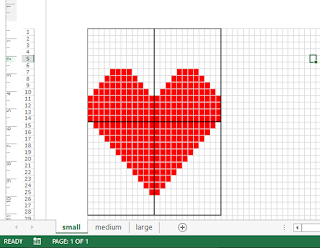
Now you're ready to work.  Let's start with a basic heart motif:

All you do for this is select the cells (squares) you want to create your design in and choose this button from the toolbar:


That done, you can design your motif in colour.  We're not going to change colour when we knit it, but it makes it easier to see and design.

The reason for designing on something like Excel (or good old graph paper) is that there's a lot of trial and error involved.  In fact, even with designing in this way, you'll probably find that you undo your work at least twice to make slight adjustments to your design.  Designing first reduces the number of times you may find yourself undoing and redoing your work, which is better for the yarn as being overworked can make it thinner or bobbled and it's harder to maintain tension.  Your stitches can also become twisted if you pick them up incorrectly once you've ripped your work back.    

For example, I've created a heart motif before, but still hand to design twice on Excel for this blog:

a) 

As you can see, this heart is sweet and in perfect proportion.  However, I'd decided I wanted a 10x10 design and this is only 5x6.  In addition, it's not centred. I needed to make it bigger, and also centre it.

b) 
This heart is larger and will be more in keeping with my project, but it looks very pointy and a little unfriendly at the top: it needs softening and centring.

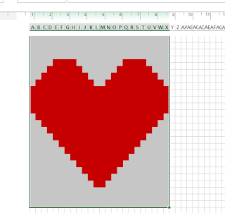
c)  

This heart is much better as I've softened off the edges and it's still a better height.  I may work it up once and decide it needs reworking again owing to overall scale, but I'm happy with the design.  The only thing left to do is to centre it by moving it up two squares (rows).

Again, there are probably simpler ways to do this but I chose to remove the borders and then reinstate them two rows lower than I had before, so now the heart is as close to centre as it could be.

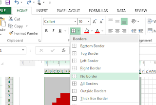
First, select your whole design area.

Then choose "no border"


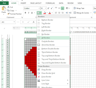
Select an area two rows below (or however many required to centre your design) where it was before.

Choose "all borders"

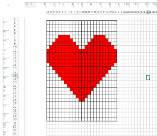
Then, in the same way as we did to find our centres originally, select a quarter of your working area at a time and choose "thick outside border".  Repeat for all four quarters.

Et voila!


What if I want to create a more technical design?

Really, it's all up to your imagination!  I would advise against using single knit stitches and single purl rows as your motif will lose definition.  An example of this going wrong is with my Sailboat motif:


Now, at first glance, this might seem like a perfectly feasible design.  However, there are some serious problems with it.  While it's pretty much bang on centre (it's an odd number of rows so it won't be quite perfect), I've had to use knit stitches for the base of the mast, then leave it as purl stitches in order to define it from the sails either side.  In addition, I've only left 1 row of purl stitches between the hull of the boat and the sails themselves.  While it looks great on paper, in practice there was no definition and you had to really squint to see what it was I'd tried to create.  As my rows were shorter than my stitches were wide, it also ended up quite squat:  all of these are great reasons for doing your tension square and planning out your design first.  

Once you've created some designs successfully, you can become more adventurous.  Here are some of my favourites from around the web.  I've included links to their blogs in the captions.  

aknittingmountain.blogspot.ca 

sandra-cherryheart.blogspot.co.uk

loveofknitting.com


Saturday, 27 August 2016

PRIZE DRAW! Win a Wish-Bear!


Our first 10 subscribers will automatically be entered into a prize draw to win one of our custom made Wish Bears!

Every child needs a special friend, and a Wish-Bear is very special indeed.  Every child needs a special friend and a Wish-Bear is very special indeed.  Lovingly hand-knitted especially for you, a wish is woven into every stitch, which is strengthened with every cuddle.  As each one is entirely hand-crafted from start to finish, your bear will have its own unique personality!

These fluffy fellows come in a variety of shades: this competition includes a choice of blue, "teddy" brown, cream, and pink.  If you win, we proceed just like you were any other customer:  you select the teddy colour and I'll send you a choice of fabrics and ribbons to choose from (via photograph) so the bear is exactly as you'd like it.  You can also choose to have your bear personalised with embroidery.

The bear will be completed and dispatched within 3 weeks, and will be gift-wrapped and posted in a parcel box complete with a letter personalised for your recipient (or for you if you choose!).

Our bears also come with our unique Cuddle Insurance.  Head over to Etsy and check out this listing for full details.

 Wish Bears on Etsy

All you need to do to win is to be one of the first 10 subscribers!

Tuesday, 23 August 2016

The Tooth Fairy

When I was a child, I was never scared of the tooth-fairy.  I wasn't a fan of losing teeth: the blood and resulting hole freaked me out, but the fairy's visit was magical.  Each time I lost a tooth, I'd wake up in the morning to a fat envelope containing a typed letter from Sparkle, my tooth fairy, telling me all about her latest adventures in the land of Frairie and the journey in the Cloud Car to collect the treasure I'd left for them under my pillow.  Along the hall, my brother was equally excited when his turn came.  Under his pillow, was a fat envelope containing a typed letter from Wizard Whizz: his tooth Wizard.

However, not all children are so lucky.  My cousin, Samuel, loves all things Christmas but this year got rather scared because he didn't like the idea of Father Christmas coming into his room while he was asleep. I was surprised to hear my teenage students discussing what a "creepy" concept Father Christmas was: clearly this fear of someone visiting while you sleep isn't rare.   He got through Christmas but the obvious future struggles with the Tooth Fairy were a concern (the Easter Bunny is fine as he visits the garden).

After a bit of pondering, I was sorting through my knitting basket when I had an idea: to come up with something special, small, cute, and long-lasting that could keep the tooth safe, act as a hiding place for the "gold" and "silver" treasure, and remove the need for a) tense parents gingerly sliding their hands under their child's pillow to find the toilet-roll-wrapped tooth without waking them, and b) for the "fairy" to enter the room at all.

I grabbed some yarn and stuffing and got to work.

Five hours later, I had the first tooth fairy pillow created.
 Tooth Fairy Pillow with heart motif


As you can see, the result is a sweet little "pillow", that features a pocket on the front - the perfect size to tuck a tooth, and store some silver in return.  I was concerned about wear and so devised a way to actually knit the pocket without having to attach it afterwards.  

After familiarising myself with graph paper on Excel, I had also managed to design by trial, error, more trial, and a lot more error, a motif to go on the reverse:


This one was a challenge to design, but not to execute, as it's worked in the same yarn just by switching purl for knit stitches.  I would really recommend having a go and persevering with the design process as the results are totally worth it.  I will put up a tutorial for designing motifs on Excel later on so you can give it a go yourself!  Graph paper will work just as well.

I initially showed the tooth-fairy pillow to some mums of young children at work and it was well-received.  They loved the size, the possibilities for personalisation, and the keepsake nature of the pillow.  My aunt saw them, loved them, and promptly asked me to make one for Samuel.  


Once more I got to work and after hours of planning on Excel, I managed to work out a special motif for the back.  This is called the Intarsia method: where you work with two colours of yarn simultaneously, carrying the yarn across the back and weaving the two strands together to prevent holes.  I will be creating a tutorial for working intarsia later in the month, so check back to see that!

The best thing about this process?  Seeing Samuel's smiling face when he got his pillow (which was gift-wrapped of course) and knowing that rather than being scared of the tooth fairy, he was now excited for her first visit.  Unfortunately, being only four, he's probably got a couple of years to wait!


I hadn't planned on doing alphabets in different colours, but it just goes to show what can happen when you get in touch with a crafter:  my aunt asked for Samuel's letter to be worked on the reverse of the pillow in blue and I was able to do just that. If you've got an idea for something particular, why not comment below, or contact me to see what I can do!  

Happy crafting!
Gemma x

Saturday, 20 August 2016

Welcome to Nursery Knits UK


Hi there, everyone!

Thank you for checking out this blog: I'm so pleased to meet you and hope to share lots of ideas and inspiration with you all.  I'm Gemma, founder and crafter of Nursery Knits UK - an independent business which focuses on producing made-to-order gifts and accessories for little ones.

The business has come about due to the insistence, love, encouragement and support of some very dear friends, who have been pestering me for years to sell the knitted goods that I've made for them over the years.  I'm so proud of my products and am so excited to share them with you all.  Read future posts to find out all about our signature Wish-Bears and other products.


This blog accompanies my Facebook page: NurseryKnitsUK and will include details of my current products, new releases, and some how-to guides for the budding crochet or knitting artist.  Already I've got many exciting projects in the pipeline, including a collection of knitting patterns for babies and workshops to teach beginners how to crochet and knit!

Bear with me while I get things sorted - I'm new to this blogging malarkey - and I hope you'll enjoy reading the posts, finding out about my products, and seeing things to inspire you to pick up your needles and hooks.

Happy crafting!
Gemma xx